TwentyThree二拾衫. Merchandising Tool
Owned end-to-end discovery, design, and delivery of a 0-to-1 merchandising tool, using Claude and Cursor to build and ship, and turning markdowns into a daily driver of sell-through
Team
1 designer
2 co-founders
Claude and Cursor as engineering partners
Impact
Promotional page traffic +30%; monthly sell-through +10%.
Task time reduced by 98%, from 9 hours to 10 minutes
~13,000 products evaluated for adjustment daily, up from a partial pass every two weeks
Under 80 hours of working time to launch
My role
Partnered with co-founders to identify the problem, map the end-to-end process, and define the scope. Led research, concept development, product design, and directed all implementation through Claude and Cursor.

Background
TwentyThree is Taiwan’s second largest second-hand fashion reseller with ~13,000 one of a kind pieces.
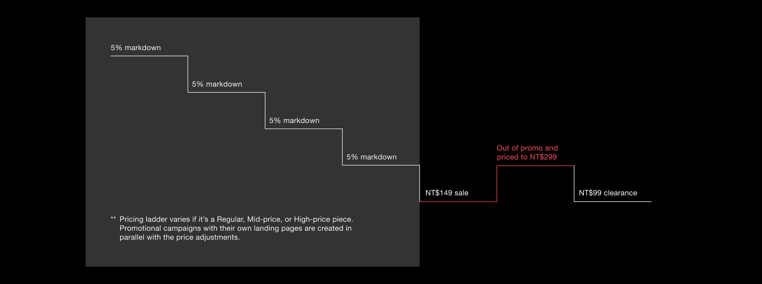
Since every piece is one of a kind and there are no restocks, their merchandising strategy for moving unsold pieces is to lower their price and put them in front of new shoppers.
How it worked before
TwentyThree adjusts prices by passing each piece through a pricing ladder twice a month. Each pass took nine hours and pieces were still getting missed. The existing process was:
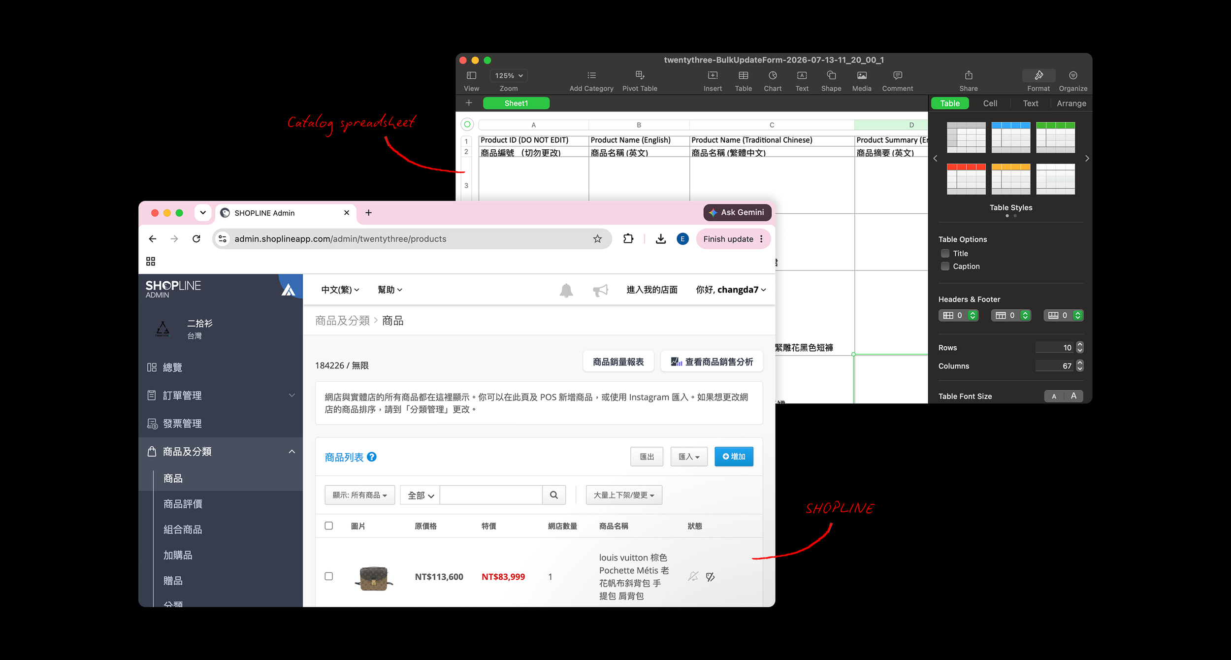
Download the full catalog from SHOPLINE as a spreadsheet.

Filter the spreadsheet for pieces due, then manually enter new prices and zones row by row.

Upload the spreadsheet back into SHOPLINE and wait for processing. The majority of the time, an error would be returned, the merchandiser would have to inspect the spreadsheet and reupload.

Framing the problem
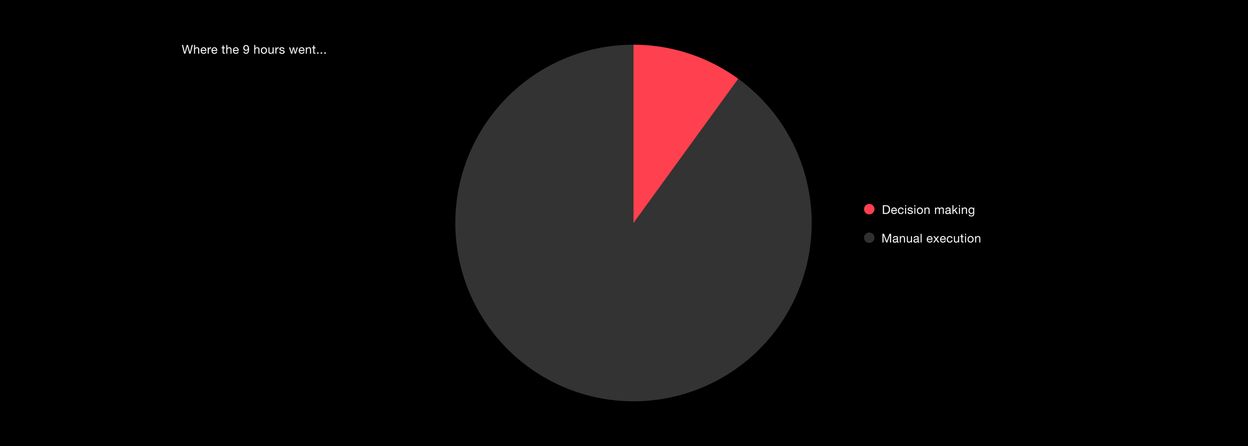
User interviews about the existing process revealed that the 9 hours spent were almost entirely manual execution, limiting the business to just two price adjustments per month.
Past cycles showed that more frequent markdowns lifted monthly sell-through by 8%, but due to being short-staffed, we are limited to two passes a month. Our goal shifted from saving time to increasing reach: adjusting the full catalog daily instead of twice a month.
Aligning the team
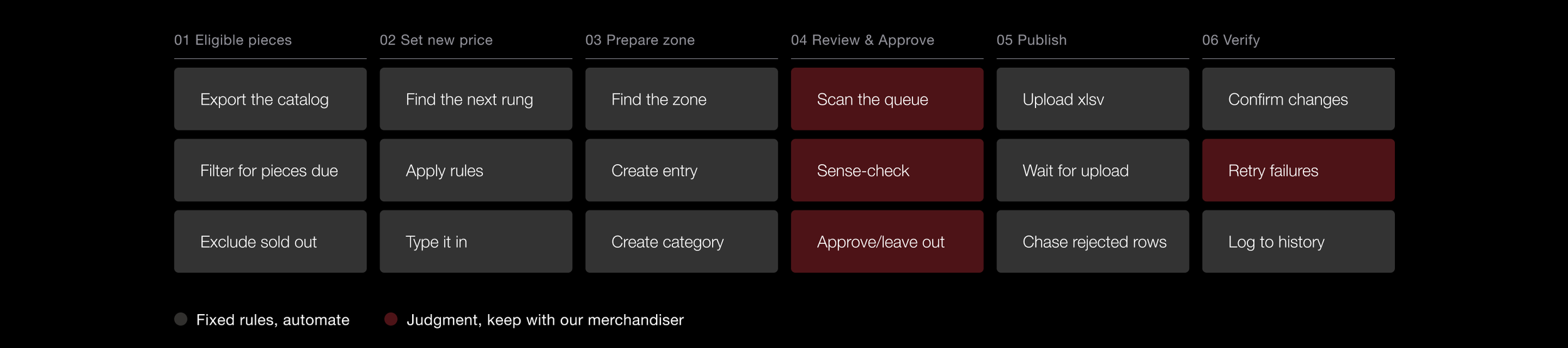
I mapped the process end to end so we could agree on what the tool should and shouldn't do.
The first prototype
In one hour, I built a review queue we could test with, where the tool proposes and the merchandiser commits.
Iteration 01 · Information density
The prototype validated the concept, but the table wasn't scannable enough for merchandisers to efficiently review thousands of products before approving price changes.
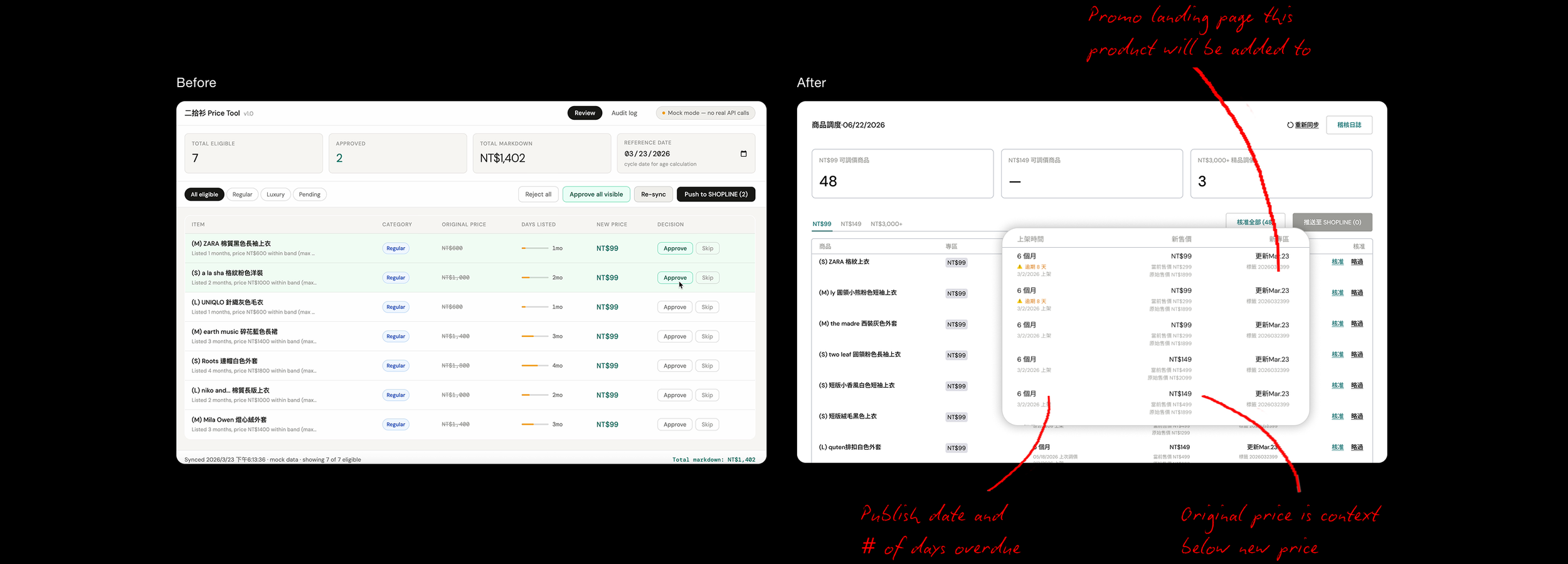
After making these adjustments, I usability tested the table with the merchandiser. I learned that:
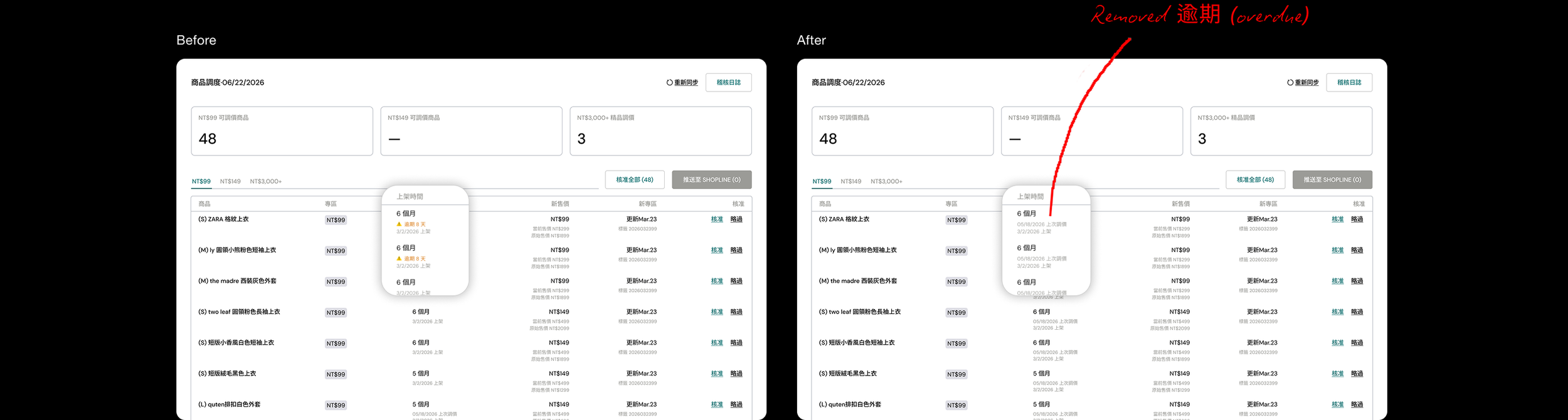
Having the columns 上架時間 (published date), 新售價 (new price) and 新專區 (new zone) side by side gave them all the details they needed to quickly double check each SKU
The 逾期 (past due) badge was the wrong signal. Missing a pricing round wasn't an issue—they simply pushed it to the next cycle. What merchandisers actually needed was the last price adjustment date to judge when an item was ready for another update.
Iteration 02 · Simplifying and tradeoffs
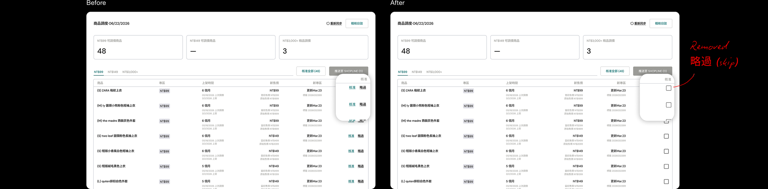
Observing our merchandiser, I noticed he never used 略過 (skip), suggesting the system reliably surfaced only products ready for price adjustment. This prompted me to question whether manual approval was still necessary. However, merchandisers occasionally delayed price changes to extend social ad campaigns. Instead of fully automating the workflow, I removed Skip and retained partial approval for those business exceptions.
Iteration 03 · Improving scannability
Zones only open on certain days and the UI required merchandisers to remember which were active on which days. After prototyping, I decided to redesign the card names to be dynamic so they could instantly see which zones needed attention that day.

Iteration 04 · Challenging the strategy, not just the screen
I encouraged our founder to simplify the merchandising strategy itself. What started out as 2 zones had become 5 as the strategy developed, each carrying its own pricing rules.
I showed that the added complexity created more edge cases, increased pricing risk, and slowed onboarding without evidence of improving sell-through. As a result, he decided to simplify the underlying pricing rules to 2 tracks, while maintaining 5 different promotional zones.

Iteration 05 · Designing for trust
Our merchandiser shared that he needed confidence that he hadn’t missed products. He expected each 10-day period to follow a cadence (50% adjusted on day one, then 10% daily for the next five days) and wanted visibility into the full plan upfront to ensure the tool matched that strategy.

Ultimately, this was the final design:
How this shipped
Under 80 hours of working time, from the first conversation to real prices on the live storefront by using 3 tools with 3 jobs:
Claude - to get to a concept fast so there's something concrete to react to.
Figma - to refine it: hierarchy, spacing, copy, states.
Cursor - to prototype it. A design file can't show what 13,000 real products do to a table. Building it can.
Two tradeoffs I made deliberately:
I optimized for speed - I prototyped directly in the existing tool rather than waiting for a separate development environment, which let me test ideas against real product data and workflows much faster. Because I was working in a live environment, I clearly communicated what was still in progress and personally verified every change end-to-end.
I used AI to bridge the gap between design and engineering - Rather than handing off a prototype and waiting for implementation, I used Claude and Cursor to build and iterate on the tool myself. For a small startup without dedicated resources for a 6–10 week agency build, this allowed us to validate the product and get it into use much faster.
Outcome
9 hours became 10 minutes. Markdowns went from a partial pass every two weeks to the entire ~13,000 product catalog, every day. All built in under 80 hours.
Time saved was the headline. Reach drove the business impact: every markdown is a fresh selling opportunity, and the storefront now has a promotion running every day instead of twice a month. Storefront traffic to promotional pages increased 30%, while monthly sell-through increased by an average of 10%.
Explore more projects